Posts Tagged ‘oil paints’

Daniel Smith Primatek Oil Paints Review – Part 2

May 31, 2014

Here is a somewhat better pic of the cool colors of the paint swatches (from left: ultramarine, turquoise, amazonite, malachite) from the last post:

Daniel Smith Primatek

Daniel Smith Primatek

Still having trouble photographing that amazonite – it’s really quite saturated out of the tube, but you’d never know it from looking at this.

The paints themselves: overall they were fine to use. Upon first opening, some of them (especially the malachite) gave off a distinctly rancid oil aroma, even though they were bought directly from Daniel Smith. Not a big deal, of course, though the smell of linseed oil is normally one of the (many) pleasures of working with oil paint.

The paints are very smooth, which personally I don’t particularly like; part of the joy of working with natural pigments is the sometimes grainier texture, which seems completely absent from these paints. I personally would like to feel the “naturalness” of these natural pigments under the brush; of course, other painters might disagree (in fact, I know at least one personally who does disagree). For me, missing out on that is missing part of the point of using natural pigments in the first place.

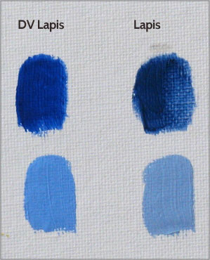
The vehicle for these paints is alkali-refined linseed oil (alkali-refined means it’s chemically processed), with the exception of the two blues (Turquoise and Lapis), which use alkali-refined safflower oil instead. Again, the choice of binders seems to me to miss the point of the paints: if you’re making a big deal out of using natural pigments, wouldn’t you want to use a natural oil to go along with them? (It’s not nearly as bad as wasting natural pigments in a thoroughly synthetic medium like acrylic, of course, but still.) Maybe it’s just me, as an enthusiast of natural art materials: but having these paints in a natural, raw, cold-pressed linseed oil, along with some greater variation in pigment particle size, would make these paints much more exciting.

Lightfastness: For some reason, the only one of these paints that has lightfastness information listed on the Daniel Smith website is the Malachite Genuine, which is listed as having “Lightfastness Rating: I.” Others of these pigments are available in watercolors and do have lightfastness ratings listed: Rhodonite Genuine, Purpurite Genuine, Lapis Lazuli Genuine, Sleeping Beauty Turquoise Genuine, Amazonite Genuine, and Malachite Genuine are all listed as “ASTM Lightfastness Rating: Excellent” in watercolor. However, there have been some lightfastness problems noted by various artists who have done their own tests. Note the changes in the Rhodonite, for instance, here by annie.nz on WetCanvas. Again note the Rhodonite here on Jane Blundell’s blog, and also the Sleeping Beauty Turquoise. These two posts seem to indicate there may be some question about those lightfastness ratings provided by Daniel Smith. (At the same time, I’ll note a general consensus that many pigments have greater lightfastness in oil than in watercolor, possibly mostly because of the thicker paint layers used).

Here are two test paintings done with the Daniel Smith Primatek paints. This first one is a sketch of some of the blue irises blooming in the backyard (the same irises from which I get the green ink). The background was done with some paints from Da Vinci and Rublev; the flower and plant parts were done with the Primateks, with some help from Rublev’s Blue Ridge Yellow Ochre and Lemon Ochre.

Irises Still Life © Bispo

Irises Still Life © Bispo

I was expecting to be able to use the Purpurite for the flowers, but that color loses too much saturation in tints. As I mentioned earlier, I was able to get better violet tints with a mix of the Rhodonite and the Lapis. (I still had to steer the tints more toward the magenta, since the Rhodonite is so much stronger than the Lapis.) The Purpurite was fine for the darker violets. Amazonite, Malachite and a bit of Turquoise did a fine job for the green plant parts, and in fact were more saturated than I needed – except for the brighter chartreuse bits, which were helped along with some of that lemon ochre.

Here is another test, a portrait of my wife Joy. For this one I used the Primatek Sedona, Pipestone, Rhodonite and Turquoise; Rublev supplied the yellow ochre, black and white.

Joy Naomi © Bispo 2014

Joy Naomi © Bispo 2014

I went a bit mad with color on this one; it’s actually quite scandalous for me, who usually uses just earth colors (and maybe a touch of madder) for skin tones. A bit of a color theory experiment, really, that was only partially sucessful. Early in the painting I got the urge to use some of the Turquoise for the flesh tones, and it worked very well for that. The Rhodonite worked fine as well, mixing nice oranges with the yellow ochre, and rose tints with white. You can see how rich the color is in the shirt; if it were just a touch redder in hue I’d probably use this paint regularly.

Overall these Primatek oil paints will be a welcome, if occasional, addition to my palette; and I have to give a lot of credit to Daniel Smith for choosing some of these unusual pigments. I’ve been wanting to try painting with natural turquoise for a long time, and it was a pleasure to finally do so, especially in the portrait. Along with that paint, the clear winners here are the Amazonite Genuine and the Rhodonite Genuine – both stunning paints that can actually compete with some of the modern synthetic organics. The Purpurite is also fun for those dark violets, and the Sedona Genuine is a good-quality, if fairly ordinary, natural red ochre. Even the three disappointments in my set – the Minnesota Pipestone, the Genuine Lapis Lazuli, and the Malachite Genuine – are still useful paints (although the Pipestone may be relegated to underpaintings, since it’s such a weak tinter). At the end of the day, I can recommend Daniel Smith’s Primatek line of oil paints for those interested in painting with natural pigments. Give them a try; and feel free to post the results back here!

Thanks for reading!

Daniel Smith Primatek Oil Paints Review – Part 1

May 5, 2014

This is a review of Daniel Smith’s Primatek line of oil paints, which I’ll post in two parts. These are a set of natural-pigment paints, some of them quite unconventional. They have this line of oil paints, and also (and perhaps more popularly) watercolors. I haven’t tried any of the watercolors yet; I probably will someday, some of them look amazing (the garnet!).

First, an overview. The colors I tried in oil are:

Sedona Genuine, a red ochre from Arizona;
Minnesota Pipestone (Catlinite), pink pipestone;
Rhodonite Genuine, a rose-colored gemstone;
Purpurite Genuine, a violet mineral;
Genuine Lapis Lazuli, natural ultramarine blue;
Natural Sleeping Beauty Turquoise Genuine;
Amazonite Genuine, a lovely green stone;
Malachite Genuine, natural copper carbonate green.

Here are the swatches. Each color is painted from the tube (some with a bit of poppy oil added) and approximately 50/50 with zinc white (Winsor & Newton). You can see which ones are the strong tinters. There are also three other paints included for comparison.

Daniel Smith Primatek

Daniel Smith Primatek

The fastest driers were the Malachite (no surprise, as it’s a copper pigment) and Rhodonite, both touch-dry after three days. The Amazonite, Lapis, Sedona and Purpurite were dry after five days, and the Turquoise after seven days. The Sedona, strangely, was the slowest dryer in the bunch, still slightly tacky after a week.

Some of these paints were very impressive, others not so much. I’ll go through them individually here.

Sedona Genuine: red ochre, opaque, medium tinter. This is a pretty standard red ochre – perfectly serviceable and pleasant to use, but nothing out of the ordinary. What makes this paint fun for me is the same thing that makes Da Vinci’s Arizona Red and Arizona Brown Ochre interesting for me: it’s local to my region. I’ll probably keep using it for that reason alone.

Minnesota Pipestone: red ochre with rose tints, semitransparent, weak tinter. I have to say, this one was disappointing. I’ve used a Pink Pipestone pigment from Rublev, ground into oil and tubed by myself, that is a delight – delicate pinks for skin tones or satin highlights on white fabric. I was expecting something similar here, but it was darker and significantly less saturated (and not NEARLY the color as shown on the Daniel Smith website!), both on its own and in tints. Here is a comparison of the Daniel Smith against my own:

Daniel Smith - Pipestone

Daniel Smith – Pipestone

Usable, I suppose, but not the exciting paint that it should be.

Rhodonite Genuine: rich rose color, transparent, strong tinter, fast dryer. This paint is one of the good ones. An amazing rose color that seems as if it must be an organic, it’s so saturated – and yet it’s ground from a stone. I immediately wanted to see if this could be used as an alternative to rose madder. It can’t, not quite – it’s a bit more magenta, and though it’s transparent, it’s definitely less transparent than madder, and therefore not as easy to glaze. But, as I’ll show, it can be used for rich skin tones.

Purpurite Genuine: dark violet, transparent, medium tinter. As many are aware, violet is a color that has long been problematic for artists, as historically there just don’t seem to be all that many usable pigments in this hue range. This one is an interesting attempt to provide another. As it turns out, purpurite is very nice for dark purples, but it loses quite a bit of saturation in tints. I was actually able to get better purple tints by mixing the Rhodonite with the Lapis.

Genuine Lapis Lazuli: natural ultramarine blue, transparent, weak tinter. This paint seemed not bad at all – until I compared it to another brand of natural lapis, Da Vinci:

Daniel Smith Primatek - Lapis

Daniel Smith Primatek – Lapis

Here you can see that the lapis from Da Vinci is significantly more saturated, both neat and in tints. Now it is possible, of course, that the Da Vinci has been enhanced with a bit of modern, synthetic ultramarine to increase saturation; I haven’t had a chance to ask them about it yet. But, assuming that is NOT the case, then that means Daniel Smith is offering a lower grade of natural ultramarine at, as it turns out, about double the price (comparing Daniel Smiths’s website against Da Vinci prices on Dick Blick). Not a great value if so. I will contact Da Vinci at some point and post their response here.

Natural Sleeping Beauty Turquoise Genuine: cyan, opaque, surprisingly strong tinter. I suppose the nearest modern color would be cerulean blue, but the Turquoise is lighter in value. I found this color to be most useful as itself – painted directly onto the canvas without much modification, or as a cool modifier for other light-valued colors to achieve pastel blues, greens, or even violets. It’s not much in the way of a general mixing color, but great as a cyan accent color.

Amazonite Genuine: green-cyan, transparent, medium tinter. This is another of the good ones. (Don’t be fooled by the photograph above – the paint out of the tube is much more saturated than that swatch looks.) Right out of the tube it looks very near to viridian. This works very well as a general mixing green, or as a glazer. An amazing (pun!) paint, really, especially for a natural pigment. On some research, I discovered that despite the name, amazonite is mined right here in the United States, making it almost regional to me. Cool.

Malachite Genuine: pale middle green, opaque, weak tinter, fast dryer. This must be a pretty fine grind of malachite, because it’s high-valued and not very saturated. At the last minute I decided to compare it to my own synthetic copper carbonate green pigment in oil (this is why the swatch on the right is almost hanging off the edge of the canvas). As you can see, the synthetic one is a bit more saturated, both neat and in tints, as well as being slightly bluer (the difference is more marked in person).

Daniel Smith - Malachite

Daniel Smith – Malachite

I think part of the point of using natural malachite is that with the larger particle sizes you can get when grinding a color from stone, you can get a more saturated color than with the smaller particles of the precipitated synthetic malachite. On the other hand, I shouldn’t forget that some of us feel a real pleasure in using a natural pigment, similar to the thrill I get when using a natural earth over a synthetic iron oxide. I also get a thrill from making and using my own copper carbonate pigment, of course, so this one is a toss-up for me.

To be continued!

Hand-mulling Paint, Part II

November 2, 2012

Continued from Hand-mulling Paint, Part I.

If you’re mulling a particular pigment for the first time, you won’t know just how much oil you should add. You can do some research online, something like “raw umber oil absorbtion” – but you don’t really need this information to begin. At first, use less oil than you think you will need. Many pigments (not all) will loosen and become more and more oily as you mull. I try to add just enough oil to pigment so that when I start mixing with a spatula, I’m pretty sure it won’t be enough oil. Then I start mulling. Often it winds up being enough after all. Once you’ve done this, you can keep notes on how much oil to add to each pigment.

You’ll go in a big circular motion with the muller, and pretty soon you’ll have to stop, grab the paint spatula, and scrape the paint together into a pile again. You’ll have to scrape paint off the sides of the muller as well. Make it into a pile and start mulling again. It helps to switch hands every so often. It can take a tiring amount of time with some pigments, and patience is sometimes required. After a while, you’ll know if you need to add more oil (or, sometimes, more pigment).

Below, I’m mulling and then scraping together a homemade copper green pigment into linseed oil:

Mulling Copper Green

Mulling Copper Green


Mulling Copper Green 2

Mulling Copper Green 2

Just how necessary is it to mull pigment? Why can’t you just mix the stuff up on the palette with a spatula and go? Well, sometimes this might work – the homemade candle black I made into an oil paint recently barely required mulling at all, and probably could have been used right after mixing it with oil – but other times, mulling is absolutely required. See the difference between mulling or not mulling Egyptian blue, below:

Mulling Egyptian Blue

Mulling Egyptian Blue

The first swatch is unmulled. It was quite difficult to even brush it out: I had to add extra oil and use one of my stiffer bristle brushes to manage it. The second swatch is after perhaps only two minutes of mulling. Big difference, isn’t it? The third swatch is the mulled Egyptian blue mixed with some zinc white. Nice color, huh?

Some earth pigments are said to display their best colors when only lightly mulled, and that this is one problem with the uniform grind of modern, industrially-produced pigments. I thought that I was seeing this phenomenon when I was grinding up a nice raw sienna from Sinopia Pigments. The more I mulled, the duller the color seemed to get. See the pic below, the difference between those two piles of paint? I thought I was seeing over-grinding in action. However, I was wrong: it was just that the finer clumps of pigment were soaking up more of the oil. When I added more oil back into the paint, its color sprang to life again. So if that happens to you, try the same.

Mulling Raw Sienna

Mulling Raw Sienna

I’ll post one more installment of the Hand-mulling Paint series, and discuss tubing your own mulled paint.

Lead White: The Real Story.

June 6, 2012

(With apologies to Stephen R. Donaldson.)

Lately there has been some hand-wringing over the shortage and high price of lead white artist’s oil paint on the market. Some artists believe that lead white is now illegal or on the verge of being so, and that it will be only a black-market item in the future – or that the artist’s materials companies are being strong-armed behind closed doors to not produce the stuff any more. Others, that the art companies themselves are jacking up the price or discontinuing the pigment voluntarily because of some kind of market disapproval of toxic materials.

That, of course, is not the real story.

Artist’s pigments, with very few exceptions (for instance Winsor and Newton’s Rose Madder Genuine or Rublev’s Stack-process Lead White), are not actually artist’s pigments. They are pigments that are manufactured for much larger industries than our little artist’s corner – for instance the massive auto, plastics, and textiles industries. The art materials industry is too miniscule to manage the economies of scale that make materials inexpensive in the modern world. So we buy pigments that are left over from the big boys and get our tubes of paint on the cheap.

In the United States, lead white was banned from commercial paints all the way back in the 1970s. There were some good reasons for it. Artist’s paints were kindly excluded from this injunction. There has been no banning of lead white in artist’s paints in the United States; nor, as far as I know, any real political discussion of such. Lead ammo, yes. Lead fishing tackle, yes. Artist’s oil paints, no. I believe we are probably safe from Washington in this regard. We’re under the radar. (Europe is, unfortunately, a different story.)

However, since that ban on lead white in commercial applications occurred in the 1970s, the big manufacturers have almost entirely shut down production of the material. Why shouldn’t they? Artists still wanted it, but the larger industries couldn’t use it any more – and again, we’re just way too small of a sector to make it worthwhile for them to keep producing the stuff just for little old us. No economy of scale, in other words.

Without the economy of scale provided by larger industry consumption, materials are going to be more expensive. No way around that. So artist’s paint companies have a choice: Keep selling lead white paint, but at a higher price – or drop the pigment from their lineup. Only a few have chosen the former.

Those interested in reading more should check out this recent article by George O’Hanlon over at Rublev. In it, he describes how basic lead carbonate is still obtainable from Asia, though with some difficulty. His article is what inspired this post.

So, two things: one, lead white will probably still be around for awhile; and two, yes, it’s going be more expensive. And that’s the real story.

Hand-mulling Paint, Part I

April 16, 2012
Mulling Yellow Lake in Oil

Mulling Yellow Lake in Oil

For the past few years, I’ve been mulling paint, both watercolor and oil. Mulling is the process of dispersing pigment into a painting medium. This involves some elbow grease at times, since you’re breaking up larger glomerates of pigment into smaller glomerates. (Though mulling is often called grinding – slightly older terminology – you’re not actually grinding pigment particles into smaller pigment particles. With homemade pigments, though, there are some exceptions: for instance, there’s just only so fine I can grind eggshell white in a mortar and pestle; the fine grinding of that pigment happens with the muller.) Some pigments take longer and require more work, some less. The vermilion that I ground up recently was very quick and easy.

Eggshell White on the Palette

Eggshell White on the Palette

So: why mull paint, when there is so much in the way of ready-tubed paint to be had at the art supply store? Well, here are a few reasons one might want to mull their own paint:

One, to save money. Art supply companies often charge premium prices in what is, after all, a niche market. Understandable. But if one is willing to do a little work oneself, a noticeable amount of money can be saved for our hero, the starving artist. Remember the recession?

Two, to make a paint with a pigment that isn’t available on the market. If you’re a fan of de Laszlo and you’ve got a particular hankering to try painting with chrome orange, you’re just going to have to make that paint yourself, because it doesn’t exist in a tube at the store. Or, in my case, I wanted to mull up the pigments that I’ve made myself. (That’s actually what got me started mulling.)

Three, to produce paint with specific qualities that are not currently popular in tube paint. I personally like gritty, goopy paint, especially in earth colors (it’s just no good if I can’t make happy, chunky swirl sculptures on the palette), and it’s pretty easy to mull up a bit for the day and slap it onto the palette. I have found some paints on the market – Rublev in particular – that match the qualities I like, so I use a combination of home-mulled and bought paint.

Mulling Vermilion Oil Paint

Mulling Vermilion Oil Paint

(Related to this: some pigments alter their color depending on the grind. Vermilion, pictured at right, has been said to become brighter and more orange the finer it is ground. Copper pigments such as azurite and malachite become brighter and less intense – you could theoretically model an entire form using only different grinds of azurite!)

Oh, and Four, just for the experience. It can be quite satisfying to make your own paint, and even more satisfying to paint with it! – and it certainly educates one about materials. I recommend trying it!

The equipment you’ll need to start mulling your own paint: A muller and mulling slab (usually a tile of glass, but it could be stone as well); a paint spatula; and a rough material for roughening the glass surface of the slab. Maybe a gripping material like a cabinet liner, so the slab doesn’t slide all over the place while you’re mulling. Oh: and pigment and binder. How could I forget!

Next: Mulling and Tubing Your Own Paint!

Back to the Student Palette

February 26, 2012
Student Palette - Layered

Student Palette - Layered

Here’s the next one in the batch. I wanted to use a slightly wider palette of earth colors for this one: In addition to my base palette of Rublev Ercolano Red, Venetian Red, Blue Ridge Yellow Ocher and Lead White #2, and Da Vinci Magnetite Genuine, I added Da Vinci Hematite Violet and Arizona Brown Ochre, and Winsor & Newton Burnt Umber. All the earths are natural except the WN Burnt Umber, which as has been discussed is likely synthetic. The violet shirt is done with the Violet Hematite, black and white. (Cool that that’s a natural earth, huh?) The “blue” shirt is just black and white.

Once again I’ve turned to Steve McCurry for my reference. I cannot say enough about his books as a learning tool for students of portrait art. Of course you can’t sell derivative works, but if you’re doing studies, these photos are just great for reference – interesting characters, good lighting, and so on.

Brunaille

Brunaille

This is a layered painting, unlike the others of mine in the thread. I used brown ochre and lead white for the underpainting. This sort of brown underpainting – transparent, opaque, or a combination of the two – has been called a brunaille.

My goal was to experiment with an impasto underpainting, and glaze, scumble, and wipe away earth colors on top of it. Though not everything is working here yet, I am really pleased with one part of the painting, which is the forehead, the part where I actually took that goal seriously and went for it.

Glazes Wiped Away

Glazes Wiped Away

Longtime readers may remember the posts on the so-called verdaccio technique from some time ago, and may see a connection here. I have long been thinking of getting back around to that technique, as I had the impression that the basic procedure was sound, but that the materials were bunk. This painting is going back in that direction – at some point I will try an actual pedigree verdaccio underpainting with glazes, and see if I can’t make something good come of it.

Next post: Mulling your own paint!

The Student Palette

November 27, 2011
Portrait using Student Palette

Portrait using Student Palette

The oldest palette, according to the story of the previous post here, has been in use for about a hundred thousand years or so. The palette consists of black, white, red ochre, and yellow ochre: these are the colors that have been used in cave paintings for all of our long prehistory, readily available and easily processed and used. Black, white, red and yellow are often the earliest colors to receive their own names in a culture, and I hypothesize that that’s precisely because those are the four colors that are universally in use. Pliny the Elder mentioned that the great Greek painters used the colors Attica earth (yellow ochre from Attica), Sinoper (red ochre from Sinope), black and white. And earth reds and yellows, plus black and white, have made up the greater part of easel painters’ palettes since the Renaissance (at least up until the Twentieth Century). This basic palette of earths and neutrals has been called the student palette, because the paints it uses are so inexpensive, and also because the restricted palette is an excellent learning tool.

Working with such a restricted palette has its own challenges and rewards. One challenge of using earth colors only is that they lose saturation quickly in either tints or shades. Another is that it’s difficult to avoid a monochrome look to the painting. But, with patience, it’s a palette that does work for portraits. The reason it works, aside from the fact that earth colors mixed with white naturally resemble skin tones, is something called simultaneous contrast. Simultaneous contrast means that colors have an effect on each other’s appearance when placed side by side; in particular, they tend to push away from each other, perceptually. What this means, practically, is that you can get a blue in your painting without actually using blue – a neutral gray will appear quite blue when placed among warmer colors (a mix of black and white actually is slightly blue, which heightens the effect). And a serviceable green can be had from a mixture of black and yellow ochre (in addition to the simultaneous contrast effect, dark yellow, or olive, actually looks quite green to the eye even by itself).

Sketch of Joy, student palette

Sketch of Joy

The benefits of working with a student palette: first of all, it teaches how to make effective use of this simultaneous contrast. (I think half or so of the so-called Old Master Techniques were developed simply to deal with the lack of inexpensive blue pigments, and this is one of them.) Also, one simply learns a lot about mixing with earth colors, which must be an integral part of any traditional palette – and about paying attention to values, since the student palette simply doesn’t work without good value contrast. Finally, crucially, one learns how to make a painting work without trying to match all the colors you see in front of you. Modern painting practice seems to be all about matching colors; but if you literally cannot match the colors in front of you with the paints you have available, what do you do then? Can you still make the painting work?

I wouldn’t necesssarily use this restricted of a palette in professional work – as I mentioned in the previous paragraph, you just can’t get all the colors you might need. But as a study it’s invaluable, and I definitely recommend it.

Portrait using the student palette

Portrait using the student palette

The four paintings on this page were done with variations of the student palette, and were painted alla prima (though the one at right took an extra few minutes in a second session to block in the background and the shirt). The painting at top was done using Blue Ridge Yellow Ocher, Ercolano Red (a light red) and bone black, all from Rublev, plus zinc white from Winsor & Newton. Notice the blue shirt, painted with black and white, and the green background, painted with black, white and yellow. The second painting on the page is a quick sketch from life of my wife singing and playing the piano (the other three are all painted from photo reference at the WetCanvas Reference Image Library), using the same palette as above. The painting just to the right of this paragraph was done with a slightly expanded student palette, using two red earths: the same yellow ochre and ercolano red from Rublev, plus Venetian Red (also from Rublev) and substituting Da Vinci Magnetite Genuine for the black, and Rublev lead white in place of the zinc. Other helpful earth colors can be added, of course, including raw umber, burnt sienna, terre verte, et cetera. Below is an experiment using a very limited palette indeed: Venetian red, burnt umber and zinc white only.

Venetian red, burnt umber, zinc white

Three tubes of paint

The temperature variation on all of these is very limited (though I managed a bit on the third painting), partly through my lack of experience with this palette, but mostly because they’re all painted opaquely. A good deal more variation can be achieved by taking advantage of transparent effects, and I’ll be exploring that direction in the future. Some additional reading: George O’Hanlon discusses painting with earth colors here, and here is a discussion of Marvin Mattelson’s use of earth colors for skin tones.

Candle Black

September 12, 2011
Candle Black Ink Drawing

Candle Black Ink Drawing

There was a power outage last week here in the American Southwest. You might have seen it in the news – or even been affected yourself – it was quite a large blackout, about 5 million people without power. It was interesting to go for the evening walk with the dog, seeing house after house darkened, and the unusual sight of neighbors actually talking with each other on the street. Amazing, the things that happen when the TV and computer are out. As always, it brought home to me how lucky we are to have such things as electricity at our constant disposal. With a changing world on my mind, it was a thoughtful but enjoyable walk.

When we got back home from our walk, we lit the place up with candles. Romantic and comfortable as it always is to do so, I found myself by habit still reaching for light switches in every room I entered, even though I was carrying a candle with me. The whole thing brought to mind an experiment I’d carried out some time before to make a different kind of carbon black pigment. The kind of carbon black pigment with which many will be familiar is vine black – created by calcining grapevines in the absence of oxygen – but there’s another kind described in various treatises from the Middle Ages that is made from candles. This is a black pigment with extremely fine particles, which mixes very easily into linseed oil, and makes a beautiful black ink. It’s also a snap to make. Here’s how you do it:

Making Candle Black

Making Candle Black

First, the equipment. You’ll need, not surprisingly, a candle. But not just any candle: this needs to be a natural beeswax candle, not the paraffin or carnauba wax variety. Preferably, it will be a beeswax candle with no perfumes or dyes. You’ll need some kind of metal bowl capable of holding water, and some way to hang it suspended above the candle while the candle is lit. It doesn’t have to be fancy; you can see the system I’ve jury-rigged here. In fact you can tell a lot about me and the kind of stuff laying around my household from taking a look at the different objects I’ve used here: two fantastic books from the DeYoung Museum in San Francisco about impressionism and post-impressionism; an old paintbrush holding up the bowl; a sketchbook to adjust the height of the candle (notice how the cover is bound upside down–I saw it that way on the shelf and of course had to grab it); and the table underneath protected by a newspaper clipping about the power outage, which I just had to put under the candle.

Making Candle Black

Making Candle Black

Fill the bowl with cold water, suspend it, then light the candle and put it under the bowl. The candle flame will deposit its black soot on the underside of the bowl. This is your pigment. You can see in the pic how close the candle should be to the bowl. This will heat the bowl up quite a bit, more than one might think, and that’s why it’s necessary to fill the bowl up with cold water before beginning.

Making Candle Black

Making Candle Black

One of the great things about making candle black is that it’s not labor-intensive at all. You can walk away and do something else while you’re making your pigment. Just wander back once in a while and put a finger into the water to make sure it’s not getting too hot. Once it starts to feel a bit on the warm side, blow out the candle, pour the water from the bowl into a garden plant, and simply scrape your black pigment from the bottom of the bowl. You can keep doing this as long as you wish, of course; you can also periodically move the lit candle around to deposit pigment over a larger area.

Candle Black in Oil

Candle Black in Oil

In this image you can see what this candle black pigment looks like in oil. I made a little set of swatches using homemade candle black and lead white from Rublev. Straight candle black in oil is a really rich, inky black, slightly darker even than my bone black from Rublev. Mixed with lead white, it makes fairly neutral grays. If you’re working in oils with candle black, keep in mind the very small particle size of this pigment, likely much smaller even than lake pigment particles. This means that it might lead to premature cracking of your darks if used too thickly on its own.

Candle Black in Oil

Candle Black in Oil

But where this pigment really shines is as an ink or watercolor. With oil, the candle black pigment dispersed very easily with no mulling at all, just a little mixing together with the palette knife right on the palette. In water and gum Arabic, however, the pigment resisted dispersion mightily. I had to resort to mixing in a couple of drops of glycerin, which helped. Nevertheless, once finally dispersed, it made a beautiful ink. In the large image at the top of the post, you can see the drawing I made with this ink. I’ve been trying to figure out a way, in my ink drawings, to mix quill work with brushwork. This represents another attempt to do so. I don’t think I’m there yet; but this one is better than some of the ones I’ve done recently, and I’m happy that my more successful attempt happened with the homemade ink.

Candle black is a beautiful color, historic, sustainable, and easy to make. Grab a beeswax candle and give it a try!

Da Vinci “Natural Pigment” line of oil paints

August 7, 2011
Da Vinci Natural Pigment oil paints

Da Vinci Natural Pigment oil paints

I thought I’d show some of the Da Vinci “Natural Pigment” line of oil paints, since I’ve got several of them, and they came up in Mariposa’s “Snob Paints” thread (in the Oil Painting forum at WetCanvas). As I mentioned there, I think Da Vinci paints are underrated paints in general. They are all nicely long and brush out well, and are willing to separate in the tube after a while (in my opinion, this indicates an appropriately small amount of stabilizer in the paint). Da Vinci are my favorite non-premium oil paints, though I admit a few of their pigment choices and color names are questionable to me. But I think their line of Natural Pigment paints is really noteworthy. To the right is a pic of the ones I’ve got on the palette.

Each is shown from the tube, then mixed with an approximately equal amount of Winsor & Newton zinc white.

In the group of four on the top right are (from right to left): Natural Gold Ochre; Brown Ochre Geothite; Arizona Red; and Hematite Violet.

Da Vinci Natural Pigment

Da Vinci Natural Pigment

These are the four that are most impressive right out of the gate. The Natural Gold Ochre is one of the two most intense yellow ochres I’ve used (the other being Rublev’s Lemon Ochre). I’m fairly certain it is a Blue Ridge blend of yellow ochres. The Brown Ochre Geothite should really be called Orange Ochre in my opinion, it’s great for warm darks in skin tones, or for glowing highlights in hair – it’s like a warmer version of raw sienna. The Arizona Red is my best dark scarlet earth, and I love that the pigment is regional here. And the Hematite Violet – well, just look at it. It’s a glorious, intense dark red that steers hard toward magenta in tints. Love it – love it!

Next group of two, again right to left: Arizona Brown Ochre; and Red Iron Stone.

Da Vinci Natural Pigment

Da Vinci Natural Pigment

These are two that I was relatively unimpressed with at first, but which have proven themselves extremely useful. The Arizona Brown Ochre has been very good for underpaintings, as well as being a helpful starting point for mixing various nondescript midtones that can be tricky to get to precisely. It dries very quickly (must be an umber of some sort, though it’s opaque), which keeps it off my palette much of the time unless I have a specific use for it; and it has low tinting strength. The Red Iron Stone turns out to be a nearly perfect starting point for flesh halftones, and in contrast to the previous paint has a pretty high tinting strength (the tint here actually contains somewhat more white than red).

The last group of three: Olive Oxide; Lapis Lazuli Genuine; and Magnetite Genuine.

Da Vinci Natural Pigment

Da Vinci Natural Pigment

These last three are paints that I find pretty and interesting, but which I just haven’t had much use for yet. I plan to try the Olive Oxide for underpaintings. The Lapis makes a great glazing blue, being less intense than ordinary ultramarine; I just haven’t happened to need a glazing blue in any of my recent paintings. The color of the tint in this pic has been somewhat blasted out by the light source; nevertheless it is not strong in tints. The Magnetite is somewhat like a Mars black (in fact it is a natural iron oxide), but with a very low tinting strength, practically disappearing in some mixes. I’m sure this will make it useful for things like neutralizing skin tones, once I get more used to using it.

At a price range of $11 to $20 for earth colors, these might be considered slightly “snobby” paints. To me they’re worth having, and I recommend trying some of them – I have found it interesting and fun (and easier!) to paint flesh with many different earth colors, rather than just a couple of cadmiums. The most expensive among those I have are the Lapis (unsurprisingly), the Gold Ochre, and the Red Iron Stone. There are a few of the line I still need to try.

The “must-have” of the bunch: Hematite Violet. Definitely.

Da Vinci Hematite Violet

Da Vinci Hematite Violet

Crossposted to a couple of forums at WetCanvas.

Watching the Grandchildren – layering process

July 24, 2011

I’ve just finished the most recent oil painting – It’s called Watching the Grandchildren. I had a lot of ideas in mind while I was painting it, and a lot of struggles as well. One thing that went pretty well, better than I had a right to expect probably, was a complex layering process on the blouse and wrap of the subject. The blouse has a complex pattern on it, and tassles as well – underneath which is a strong red color. I knew I wanted to use a rose madder glaze (can’t get enough of that madder these days), and as I’ve posted before I wanted to use the madder in a flat glaze layer so that any eventual fading will not break the picture. So, I would model forms in an underpainting and then glaze over that, as expected – but in this case some elements would have to go over the glaze layer as well. So how to layer everything? I made a plan and followed it, and here’s how it went:

Leo Carillo layer 1

Leo Carillo layer 1

The underpainting is Da Vinci Arizona Brown Ochre and Rublev Lead White #2 (lead white in walnut oil). I use paints from both of these companies regularly; I’ll do reviews here at some point I’m sure. I chose brown ochre because the transparent rose color of madder makes a nice middle red color over brown, as I’ve discovered in other experiments. As I found out later, I could have made this brunaille underpainting a bit darker. Common wisdom states that the glaze layer will darken whatever’s underneath; but I’ve found that’s only true up to a point. I wound up having to darken the shadows further at the end.

Leo Carillo layer 2

Leo Carillo layer 2

Then I laid down the pattern on the shirt. I wanted to get the pattern down first and then glaze right over it, because the pattern would still show through the glaze somewhat, so that I’d be able to use it as a template for repainting it on top of the glaze layers later. I figured if I tried to just tackle the pattern on top of the glaze for the first time, I’d wind up messing it up – erasing and lifting and correcting and scrubbing – and run the risk of ruining the crystal clarity of the madder glaze that I wanted. I think I was right about that; a pattern like this is not something I find so easy to do. My wife mentioned that I might stop painting at this point, and that was a compliment; but it wouldn’t have worked to leave it here. Besides, how could I resist the next step? It’s got madder in it!

Leo Carillo layer 3

Leo Carillo layer 3

This is what the first glaze of madder looked like. For some reason this particular color seems nearly impossible to photograph accurately. From this point on, heavy Photoshopping was necessary for each photograph, and so you may see some variation from pic to pic. I liked the color of the madder here, of course, but the blouse wasn’t really dark enough to make the composition work. It had to really stand out from all that white wall – especially since it would have all that distracting pattern in there. In a composition, focal point is everything. So more layers were necessary. Madder, of course, takes a long time to dry in oil; this stage of the painting took a while.

Leo Carillo layer 4

Leo Carillo layer 4

After three glaze layers of madder it was pretty much as you see here, dark and rich. But if I’d made the underpainting any lighter than it was, it wouldn’t have worked. I would have had to keep darkening with another layer of rose madder, and that might have made the element too saturated in color. It’s right on the borderline already (although, of course, this nice thick layer of madder gives some wiggle room for fading later on). Sometime before I try doing this again, I’m going to have to do a bunch of glazing studies over drapery, to really become familiar with just how these very transparent paints interact optically with differently-colored underpaintings. I’ll try various madder lakes, of course, but also ultramarine, Prussian blue, weld, carmine, verdigris, and perhaps lac. When I do these studies, I will most certainly post them here.

Leo Carillo layer 5

Leo Carillo layer 5

At last I was able to restate the pattern on the shirt, using the previously-painted pattern as a template. After it was down I had to knock parts of it back a little, and emphasized other parts, for the sake of the composition. After doing that, I put the tassles above everything, and did a bit of last-hour modeling on the whole thing. Below is the final look. I planned it out as carefully as I could; still, I think I was somewhat lucky. Much could have gone wrong, and I knew it could right from the beginning. It was a bit of a tightrope walk in the dark.

Isn’t that madder pretty, though? If you’d like to see the whole painting, you can see it (and a couple of life drawings) on my artwork blog here.

Leo Carillo layer 6

Leo Carillo layer 6

This is the kind of layering technique that is sometimes required when using a limited palette of traditional colors. Some colors, like rose madder, are best used transparently – and sometimes not as the final layer. Most of the time I simply paint directly, but in situations like this one, that just won’t do. I don’t think of the color palette that I use as being particularly limiting; but sometimes it is necessary to plan ahead. Though some other aspects of this painting could have gone a bit better, I’m very pleased that the blouse turned out so well, and even more pleased to have this process under my belt for next time.