Posts Tagged ‘vermilion’

M. Graham gouache plug

July 13, 2018

Periodically someone on WetCanvas will pipe up and ask the crowd to list their picks for the best gouache brand. All due respect for my fellow artists, but some of the responses make me think a lot of people just haven’t tried very many varieties. There are others out there besides the ones you can get at Michael’s.

I have a good friend, an illustrator who’s unfortunately developed some rather horrific allergies to certain art materials, including solvents, alkyds and even most watercolor preservatives. (Yes, he’s that sensitive. Airbrushers take note: if it’s in the air, it’s quietly bulding up in your body.) I emailed M. Graham on his behalf to ask about their gouache ingredients. Unsurprisingly, they couldn’t list for me their proprietary ingredients; however, they kindly offered to send us some sample tubes. When I received them I was pleased to find they weren’t the miniscule promotional samples I’ve seen from other companies, but full-sized, 15ml tubes.

It turns out that not only are M. Graham gouaches one of only two brands my friend can safely use, but we were both blown away by the quality of the paint. Their gouache prices are so reasonable ($12.50 for a tube of genuine cadmium orange!) you might think they couldn’t be that good. But they are. Out of the six or seven artist-quality gouache brands I’ve had the opportunity to sample, they’re tied for first place with Schmincke (also amazing, but considerably pricier). And their pigment lineup is attractive, with a full range of cadmiums, a PB36 cerulean (yummy!), Prussian blue, viridian, etc. No, I’m not getting paid to say it. I’m happy to plug a great company with such a fantastic gouache offering. These paints come fully recommended by moi.

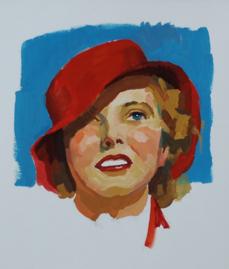
I’m currently trying to get my hand back in by doing some gouache sketches, so I filled out my palette.

After Loomis

After Loomis

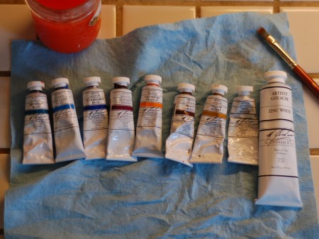
Here are my M. Graham colors:

M. Graham gouaches

M. Graham gouaches

For those longtime readers shocked to see a synthetic organic on my palette, the alizarin crimson is just a placeholder to jumpstart my sketching until I can make some of my own gouache paints to supplement these. Yes, of course I’ll be making my own! In fact, I’ve already started:

Vermilion gouache!

Vermilion gouache!

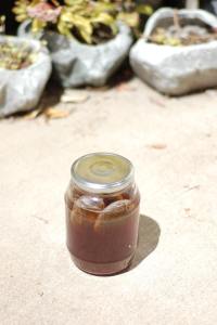
Sun tea

Sun tea

Bispo’s remedy for mulling paint on a hot summer day: sun tea!

For instant sun tea, try Trader Joe’s Irish Breakfast Tea—it’ll be ready in a jiffy. The stuff’s serious. (No, I’m not using a pigment jar for my beverage—perish the thought!)

As for the Sisyphean task of keeping ant scouts from suiciding in your vermilion during mulling, I’ll leave that post for another day.
Hand-mulling Paint, Part I

April 16, 2012
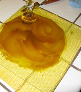
Mulling Yellow Lake in Oil

Mulling Yellow Lake in Oil

For the past few years, I’ve been mulling paint, both watercolor and oil. Mulling is the process of dispersing pigment into a painting medium. This involves some elbow grease at times, since you’re breaking up larger glomerates of pigment into smaller glomerates. (Though mulling is often called grinding – slightly older terminology – you’re not actually grinding pigment particles into smaller pigment particles. With homemade pigments, though, there are some exceptions: for instance, there’s just only so fine I can grind eggshell white in a mortar and pestle; the fine grinding of that pigment happens with the muller.) Some pigments take longer and require more work, some less. The vermilion that I ground up recently was very quick and easy.

Eggshell White on the Palette

Eggshell White on the Palette

So: why mull paint, when there is so much in the way of ready-tubed paint to be had at the art supply store? Well, here are a few reasons one might want to mull their own paint:

One, to save money. Art supply companies often charge premium prices in what is, after all, a niche market. Understandable. But if one is willing to do a little work oneself, a noticeable amount of money can be saved for our hero, the starving artist. Remember the recession?

Two, to make a paint with a pigment that isn’t available on the market. If you’re a fan of de Laszlo and you’ve got a particular hankering to try painting with chrome orange, you’re just going to have to make that paint yourself, because it doesn’t exist in a tube at the store. Or, in my case, I wanted to mull up the pigments that I’ve made myself. (That’s actually what got me started mulling.)

Three, to produce paint with specific qualities that are not currently popular in tube paint. I personally like gritty, goopy paint, especially in earth colors (it’s just no good if I can’t make happy, chunky swirl sculptures on the palette), and it’s pretty easy to mull up a bit for the day and slap it onto the palette. I have found some paints on the market – Rublev in particular – that match the qualities I like, so I use a combination of home-mulled and bought paint.

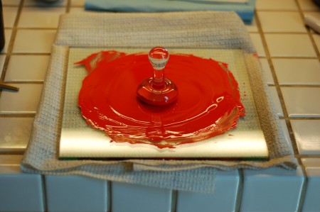
Mulling Vermilion Oil Paint

Mulling Vermilion Oil Paint

(Related to this: some pigments alter their color depending on the grind. Vermilion, pictured at right, has been said to become brighter and more orange the finer it is ground. Copper pigments such as azurite and malachite become brighter and less intense – you could theoretically model an entire form using only different grinds of azurite!)

Oh, and Four, just for the experience. It can be quite satisfying to make your own paint, and even more satisfying to paint with it! – and it certainly educates one about materials. I recommend trying it!

The equipment you’ll need to start mulling your own paint: A muller and mulling slab (usually a tile of glass, but it could be stone as well); a paint spatula; and a rough material for roughening the glass surface of the slab. Maybe a gripping material like a cabinet liner, so the slab doesn’t slide all over the place while you’re mulling. Oh: and pigment and binder. How could I forget!

Next: Mulling and Tubing Your Own Paint!

From Student Palette to Zorn Palette

January 22, 2012
Student Palette Portrait

Student Palette Portrait

As described in my last post, I’ve been working with something called the student pallette. This is a severely restricted palette using only earth colors, white, and black. I’ve been working on that some more, as you can see from the pics I’ve posted here. The color palette of the painting at top uses: Rublev’s Raw Sienna and Venetian Red; Da Vinci’s Magnetite Genuine; and Winsor & Newton’s Flake White #1. The color palette of the second painting is: Rublev’s Blue Ridge Yellow Ocher and Ercolano Red; Da Vinci’s Magnetite Genuine; and Winsor & Newton’s Cremnitz White (a blend of lead and zinc whites). So all natural earths, plus white.

Student Palette Portrait

Student Palette Portrait

It’s rather difficult to work this way. I wrote something to the effect that it is like doing calisthenics. You’re fighting to get as much saturation as possible out of earth pigments, while at the same time maintaining your valued structure. At the end of a couple of hours it can feel like you’ve been in a battle.

One of the more difficult things about using this palette is maintaining temperature contrast. Even the slightest amount of blending – intentional or not – and the colors just disappear into each other, making something that looks like a monochromatic painting. This may be partly psychological as well: when you’re fighting for saturation, the last thing you think about doing is deliberately de-saturating some tones to get that temperature contrast. However, as my instructors have pointed out, desaturating some tones is the best way to get other tones look more saturated – in other words, if you want one note to look more saturated, place a less saturated color next to it.

Mulling Vermilion Oil Paint

Mulling Vermilion Oil Paint

Despite these difficulties – or, I should say, because of them – I highly recommend working with this palette. I feel like I’ve learned quite a bit about painting just from the half dozen or so paintings that I’ve done this way. I’d like to include a third painting here, one that was done with a different palette. This one was done in the Zorn palette, wherein the red earth in the student palette is replaced with vermilion. And for the first time, I’ve gotten some genuine vermilion to work with.

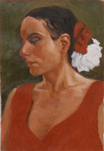
Zorn Palette Portrait

Zorn Palette Portrait

I purchased the pigment from Kama Pigments (which was a good deal less expensive than purchasing a tube of real vermilion paint). Because the jury is still out on the toxicity of vermilion, I took a few more precautions than I normally do when mulling paint: I took everything out to the garage, left the door open, and wore a mask and gloves. (I still managed to get a bunch of vermilion paint on me. Of course.) This pigment makes the most incredible vibrant red imaginable. And it’s got pretty high tinting strength in mixes; however, it doesn’t paint at all like cadmium red. You have to fight cad red a bit to get it to behave itself in skin tones – but mixing skin tones using vermilion and yellow ochre was a breeze. I’m not sure I can explain exactly what makes it so different from cadmium red. I guess I’d say that Vermillion wants to mix into skin tones – whereas cadmium red has no such desire.

One sketch, and I already love this paint. I know I’ll be using it more. In my last post, I wrote that the Student Palette is great for study, but probably not robust enough for most professional work. Vermilion is for the professional stuff.