With matte, water-based media—gouache, casein, or transparent watercolor—some pigments can suffer a shift in color when losing moisture. The reason for this is physical—the scattering of light, or some such physics thing. The reason this doesn’t happen to the same extent in oil paints is that they remain more or less “shiny,” continuing to scatter light similarly to they way they did before curing, which is close to the refractive index of the surrounding air (again: or some such thing—I never took a physics class in high school, and I’m sure it shows). When gouache or casein dry they effectively go from glossy to matte, so some change in color is to be expected. For a useful (if incomplete) reference on how different pigments behave in watercolor, check Handprint: watercolor drying shifts.
Many artists have learned to deal with this phenomenon. A quick image search for gouache paintings or casein paintings proves this amply. If you’re intimately familiar with your materials, you can keep an eye on which pigments you’re mixing, judge the drying shifts they’ll undergo, and adjust your mix accordingly—before laying it down. If you really know what you’re doing, you won’t be surprised by the result when it changes. Many, many good artists have learned how to do this.
Personally, I can’t deal with it. It freaks me out. I feel like I have enough trouble predicting how a color will look in a composition without having to worry about it changing on me after I lay it down.
Oh, I can handle it to some extent. I have to, if I want to use casein or gouache (which I do—the matte aspect means they’re easy to photograph and reproduce, which makes them ideal for illustrations). I can deal with some loss in saturation, and with small changes in value. But if either one becomes too drastic, I start losing my cool.
So I try to stick with the colors that have smaller drying shifts. One of the reasons I haven’t used natural indigo as much as I would’ve liked is that it loses much of what little saturation it has when it dries. Dry swatch is on the left:
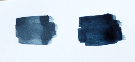
Drying Shift Natural Indigo
What starts out as a lovely deep blue becomes something pretty close to gray. No fun! (Note: while I did paint the newer swatch a bit darker, the photo shows the dry swatch less grayed than in real life. I’ll let you know when I’ve conquered the skill of photographing artwork.)
One of the most dramatic value shifts I’ve seen is the “Ultramarine Blue Deep” in Jack Richeson’s Shiva brand of casein. It may be “deep” when wet, but that’s hardly an accurate description of the dried color. Dry swatch on the left:
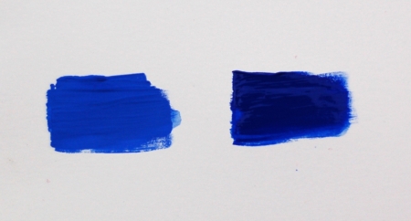
Drying Shift Ultramarine Blue Deep
I can’t use that paint. It just changes too much for me to manage it in mixes.
I told some folks at WetCanvas that this was the most extreme shift I’ve ever encountered, but when I wrote that I’d forgotten about my experiments with egg tempera some years ago. My rose madder pigment in egg tempera might have had an even larger shift, with the beautiful deep crimson changing back to the dry pigment color, which is a faded pink. Again, not usable, for me at least.
PBr24 also has something of a drying shift. Luckily, the tube I have happens to be from Schmincke, where they’ve tried to help out with this. Check it out, dry swatch on the left (note: colors are significantly more orange than IRL):

Drying Shift Titanium Gold Ochre
See what they’ve done there? The color displayed on most paint packaging tends to have only a vague relationship with the color inside the tube or pan. This label matches not the paint color in the tube, but the paint color as it will be after it’s dried. And that, my friends, is one of the things that set Schmincke apart from their competitors.