Posts Tagged ‘natural pigments’

How to Make Madder Lake, part 2

January 9, 2015

Previous post: How to Make Madder Lake, part 1.

The second secret.

There’s actually another little ‘secret’ to making madder lake, this one a bit more of an open secret, but something very important to keep in mind. It is this: you can’t just boil madder up the way you can with carmine lake or most other dyestuffs. The alizarin color in madder is destroyed by high heat, so you can’t turn the temperature up over 170ºF or thereabouts. However, the dye will not emerge from the roots unless it’s heated, so your job is to get the temperature up to between 120ºF and 140ºF, and keep it there.

(Note: the vulnerability of madder to high heat is something I’ve read from numerous sources. However, more than once I’ve accidentally allowed the temperature of the dyebath to briefly stray up toward 200 degrees, and it hasn’t seemed to hurt the resulting color much. There are many different experiments I have in mind for madder lake production in the future; one of those experiments is to give the dyebath a really good boil, to see if it really does kill the color or not. But for the time being, I’m following the recommendations about temperature control as well as I can.)

Here’s the procedure:

After the last soak and straining, put the wet roots into a cooking pot big enough to hold them, and cover the roots with water – this will be henceforth referred to as the ‘dye bath’. Water: the first time I did this, I used distilled water for everything. It wound up being a lot of distilled water! Nowadays I just use tap water, and it seems to be fine. If you want to be a bit more careful, use distilled water for the initial dye bath, and then regular old tap water for everything else.

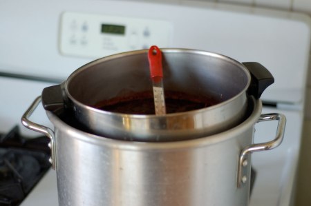
Then make a double boiler by putting this pot into a larger pot that also contains water. This way you’ll be able to control the temperature more easily. Also: the bigger the pots in question – and more specifically, the more water is in them – the easier it is to control temperature and keep it steady. Here I have this contraption cooking low on a gas stove:

Madder Double Cooker

Madder Double Cooker

A thermometer goes into the dye bath. Here I’m using a big thermometer I bought at a beer brewing supply shop – another activity that requires good temperature control! (I have acquired a slow cooker with temperature control, at some point I will try making madder lake in this, rather than the makeshift double boiler.)

Yet another little ‘secret’ to making madder: it takes a while! Cooking up carmine or weld lake takes an hour, maybe two; madder takes a couple of days at its lower temperature. At night, or when I’m out of the house, I cover the pot and turn the stove off, and turn it back on first thing when I wake up or return home. You may need to add extra water periodically to one pot or the other.

I cook the roots for about a day, then add alum to the dye bath. Alum: in my previous posts, I wrote that we were beginning with 10g of alum, but that was an error – I was confusing two different recipes in my head. I’m actually using 30g of alum here. I’ve corrected the other posts.

Take the 30g of alum and pour it into the dye bath. I like to dissolve the alum in its own warm water before adding it in, but this isn’t necessary. Then cook the dye for another day or so.

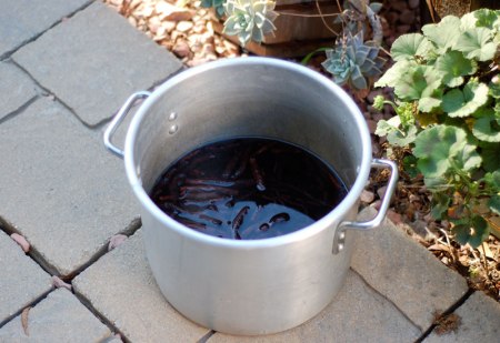
When you dip a piece of paper or paper towel into the dye bath after a few days, it should now come out a juicy, rich red. In the pic below, you can see how red the bath looks after a couple of days. This is the red you want, the alizarin! Time for the next step.
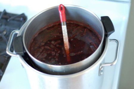
Madder Dye Bath

Madder Dye Bath

How to Make Madder Lake, part 1

December 26, 2014

Previous post: Preparation for Making Madder Lake.

In the last post, I wrote that we’re beginning with about 100g of madder root and about 30g of potash alum. I also wrote that there was a big secret coming in this one. Well, read on!

Most madder recipes I’ve seen online – including this one from Rubio Violins, which is the one I think most home chemists follow – have us putting the madder roots into water and cooking them up directly. These recipes leave out a crucial step, which is to wash the roots beforehand. One or two sources actually mention this washing, but do not mention the purpose of it, which is to remove extraneous dyes and other colors that the roots contain, and which will contaminate our lovely rose color if we leave them in there. So ‘washing’, in this case, means giving them a good soak, and then throwing out the bath water (without the baby, which is the rose dye that will not emerge until the roots are heated). Here I’ve got my roots soaking in water out of doors.

Madder Roots Soaking

Madder Roots Soaking

I soak these roots for several days. It’s best to do this when it is relatively cool outdoors, as I’m doing here. As the madder roots rest, they ferment, so you’re likely to see some bubbles or foam on the surface at some point. If it’s too warm out, a lot of mold will be generated as well. I don’t think this mold actually interferes with the making of the pigment, but it does make it a little difficult to see what’s going on in there. (Also, if it’s really hot, it might actually start cooking some of the alizarin dye out of the roots, and you definitely don’t want that yet.) So if it’s really warm out when you’re making your lake, consider moving the roots out of the sun – maybe even put them in the garage or something.

When the roots have been sitting for several days, the water should look reddish gold. At this point, dump out the water. Yes, you read that right – dump it out! Do it! I know it looks like there’s a lot of color in there that you want to be saving and using. Trust me: it’s no good. It’s just contamination. It is exactly this stuff you’re looking at that makes the finished madder lake brown instead of rose. So dump it.

This is the big secret.

Keep going at this point: refill the pot with water and strain a few times, until it comes out fairly colorless. Then soak overnight again. Then empty and strain, then soak overnight. Keep doing this until there’s not much color coming out of the water. (The purple gunk doesn’t matter – that’s from the root bark.) This entire process may take a week, or even longer. Be patient: a good madder lake is worth the wait. At some point the emptied water will start to look clearer and more pink. Once that happens, we’re ready to make our madder lake.

To be continued!

Preparation for Making Madder Lake

December 1, 2014

(The good stuff!)

It’s time to make these posts at last, after many delays: How to Make Madder Lake.

I’ve posted before about how to make a lake pigment – check this post here – and will make more posts about it in the future: about the different varieties of carmine lake, and how to make a proper yellow lake from weld, and so on. But madder lake is, well, different. It’s more involved to make a quality red lake from this dyestuff. Many have tried making madder lakes, only to be disappointed in the reddish-brown color that results, and have wondered how to make that exciting rose color we all love. As it turns out, there is one little secret that makes all the difference.

Some history: madder lake is one of the older lake pigments, found to have been used on some rather ancient objects. But for most of the Middle Ages, some of the other red lakes – lac, brazilwood, etc. – were often preferred over madder. As Daniel Thompson puts it: “To make as good a lake from madder as any beginner can make from brazil wood calls for a good deal of expert chemical knowldege and careful manipulation; and there is no evidence to suggest that medieval colour-makers possessed the knowledge necessary to making good madder lakes.” (The Materials and Techniques of Medieval Painting, Daniel V. Thompson.) Madder lake, as an artist’s material, really came into its own in the Renaissance, being used as a glazing color for drapery and so on. Its popularity continued through the Baroque, Classical, and Romantic eras; one of its popular functions was as a glaze over vermilion in drapery, creating an intense and fairly stable red.

In the Nineteenth Century, a process was discovered to make a very rich and powerful rose color from madder, using sulfuric acid. (There are some sources that report that this is when madder lake was invented; this is not true. It was this more powerful madder lake that was created at this time, a color named rose madder. It is this recipe, given by George Fields, that Winsor & Newton claim to still be using today.) We won’t be using sulfuric acid in this recipe, but we will still be able to make a nice rose-red madder lake by taking our time and following a procedure.

Making madder lake may be more involved and time-consuming than some of the other lake pigments, but the results can be well worth the investment. Not only is it one of the most beautiful lakes, and an absolute joy for skin tones, but it is also, by all accounts, far more lightfast than any other natural lake pigment. It is the only natural lake, as far as I am aware, that is still in general use by artists, because it is the only one that is considered permanent enough for artistic use (at least as an oil paint). The stuff may not last forever, but it will last, as the man said, a goodish while. And, unlike the synthetic alizarin crimson, when it does fade it appears to fade slowly and gracefully over time, rather than disappearing all at once.

The ingredients are simple and few: some madder root; potash alum; sodium carbonate (washing soda) or potassium carbonate (potash); and water. We’ll also need a slow cooker – or a little double-boiler setup that I’ll show later on – a thermometer, a large jar or two, some coffee filters and a funnel. The coffee filters: get some of the big flat-bottomed basket filters, not the cone-shaped ones – those have a tendency to spring leaks.

We will begin with about 100g of roots, and about 30g of alum. This will make a small amount of lake pigment. Stay tuned – the big secret comes in the next post!

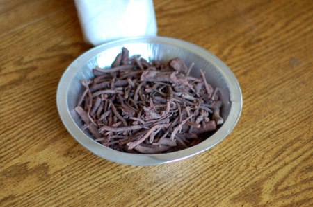
Madder roots

Madder roots

Daniel Smith Primatek Oil Paints Review – Part 2

May 31, 2014

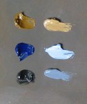
Here is a somewhat better pic of the cool colors of the paint swatches (from left: ultramarine, turquoise, amazonite, malachite) from the last post:

Daniel Smith Primatek

Daniel Smith Primatek

Still having trouble photographing that amazonite – it’s really quite saturated out of the tube, but you’d never know it from looking at this.

The paints themselves: overall they were fine to use. Upon first opening, some of them (especially the malachite) gave off a distinctly rancid oil aroma, even though they were bought directly from Daniel Smith. Not a big deal, of course, though the smell of linseed oil is normally one of the (many) pleasures of working with oil paint.

The paints are very smooth, which personally I don’t particularly like; part of the joy of working with natural pigments is the sometimes grainier texture, which seems completely absent from these paints. I personally would like to feel the “naturalness” of these natural pigments under the brush; of course, other painters might disagree (in fact, I know at least one personally who does disagree). For me, missing out on that is missing part of the point of using natural pigments in the first place.

The vehicle for these paints is alkali-refined linseed oil (alkali-refined means it’s chemically processed), with the exception of the two blues (Turquoise and Lapis), which use alkali-refined safflower oil instead. Again, the choice of binders seems to me to miss the point of the paints: if you’re making a big deal out of using natural pigments, wouldn’t you want to use a natural oil to go along with them? (It’s not nearly as bad as wasting natural pigments in a thoroughly synthetic medium like acrylic, of course, but still.) Maybe it’s just me, as an enthusiast of natural art materials: but having these paints in a natural, raw, cold-pressed linseed oil, along with some greater variation in pigment particle size, would make these paints much more exciting.

Lightfastness: For some reason, the only one of these paints that has lightfastness information listed on the Daniel Smith website is the Malachite Genuine, which is listed as having “Lightfastness Rating: I.” Others of these pigments are available in watercolors and do have lightfastness ratings listed: Rhodonite Genuine, Purpurite Genuine, Lapis Lazuli Genuine, Sleeping Beauty Turquoise Genuine, Amazonite Genuine, and Malachite Genuine are all listed as “ASTM Lightfastness Rating: Excellent” in watercolor. However, there have been some lightfastness problems noted by various artists who have done their own tests. Note the changes in the Rhodonite, for instance, here by annie.nz on WetCanvas. Again note the Rhodonite here on Jane Blundell’s blog, and also the Sleeping Beauty Turquoise. These two posts seem to indicate there may be some question about those lightfastness ratings provided by Daniel Smith. (At the same time, I’ll note a general consensus that many pigments have greater lightfastness in oil than in watercolor, possibly mostly because of the thicker paint layers used).

Here are two test paintings done with the Daniel Smith Primatek paints. This first one is a sketch of some of the blue irises blooming in the backyard (the same irises from which I get the green ink). The background was done with some paints from Da Vinci and Rublev; the flower and plant parts were done with the Primateks, with some help from Rublev’s Blue Ridge Yellow Ochre and Lemon Ochre.

Irises Still Life © Bispo

Irises Still Life © Bispo

I was expecting to be able to use the Purpurite for the flowers, but that color loses too much saturation in tints. As I mentioned earlier, I was able to get better violet tints with a mix of the Rhodonite and the Lapis. (I still had to steer the tints more toward the magenta, since the Rhodonite is so much stronger than the Lapis.) The Purpurite was fine for the darker violets. Amazonite, Malachite and a bit of Turquoise did a fine job for the green plant parts, and in fact were more saturated than I needed – except for the brighter chartreuse bits, which were helped along with some of that lemon ochre.

Here is another test, a portrait of my wife Joy. For this one I used the Primatek Sedona, Pipestone, Rhodonite and Turquoise; Rublev supplied the yellow ochre, black and white.

Joy Naomi © Bispo 2014

Joy Naomi © Bispo 2014

I went a bit mad with color on this one; it’s actually quite scandalous for me, who usually uses just earth colors (and maybe a touch of madder) for skin tones. A bit of a color theory experiment, really, that was only partially sucessful. Early in the painting I got the urge to use some of the Turquoise for the flesh tones, and it worked very well for that. The Rhodonite worked fine as well, mixing nice oranges with the yellow ochre, and rose tints with white. You can see how rich the color is in the shirt; if it were just a touch redder in hue I’d probably use this paint regularly.

Overall these Primatek oil paints will be a welcome, if occasional, addition to my palette; and I have to give a lot of credit to Daniel Smith for choosing some of these unusual pigments. I’ve been wanting to try painting with natural turquoise for a long time, and it was a pleasure to finally do so, especially in the portrait. Along with that paint, the clear winners here are the Amazonite Genuine and the Rhodonite Genuine – both stunning paints that can actually compete with some of the modern synthetic organics. The Purpurite is also fun for those dark violets, and the Sedona Genuine is a good-quality, if fairly ordinary, natural red ochre. Even the three disappointments in my set – the Minnesota Pipestone, the Genuine Lapis Lazuli, and the Malachite Genuine – are still useful paints (although the Pipestone may be relegated to underpaintings, since it’s such a weak tinter). At the end of the day, I can recommend Daniel Smith’s Primatek line of oil paints for those interested in painting with natural pigments. Give them a try; and feel free to post the results back here!

Thanks for reading!

Daniel Smith Primatek Oil Paints Review – Part 1

May 5, 2014

This is a review of Daniel Smith’s Primatek line of oil paints, which I’ll post in two parts. These are a set of natural-pigment paints, some of them quite unconventional. They have this line of oil paints, and also (and perhaps more popularly) watercolors. I haven’t tried any of the watercolors yet; I probably will someday, some of them look amazing (the garnet!).

First, an overview. The colors I tried in oil are:

Sedona Genuine, a red ochre from Arizona;
Minnesota Pipestone (Catlinite), pink pipestone;
Rhodonite Genuine, a rose-colored gemstone;
Purpurite Genuine, a violet mineral;
Genuine Lapis Lazuli, natural ultramarine blue;
Natural Sleeping Beauty Turquoise Genuine;
Amazonite Genuine, a lovely green stone;
Malachite Genuine, natural copper carbonate green.

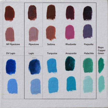
Here are the swatches. Each color is painted from the tube (some with a bit of poppy oil added) and approximately 50/50 with zinc white (Winsor & Newton). You can see which ones are the strong tinters. There are also three other paints included for comparison.

Daniel Smith Primatek

Daniel Smith Primatek

The fastest driers were the Malachite (no surprise, as it’s a copper pigment) and Rhodonite, both touch-dry after three days. The Amazonite, Lapis, Sedona and Purpurite were dry after five days, and the Turquoise after seven days. The Sedona, strangely, was the slowest dryer in the bunch, still slightly tacky after a week.

Some of these paints were very impressive, others not so much. I’ll go through them individually here.

Sedona Genuine: red ochre, opaque, medium tinter. This is a pretty standard red ochre – perfectly serviceable and pleasant to use, but nothing out of the ordinary. What makes this paint fun for me is the same thing that makes Da Vinci’s Arizona Red and Arizona Brown Ochre interesting for me: it’s local to my region. I’ll probably keep using it for that reason alone.

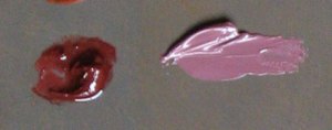
Minnesota Pipestone: red ochre with rose tints, semitransparent, weak tinter. I have to say, this one was disappointing. I’ve used a Pink Pipestone pigment from Rublev, ground into oil and tubed by myself, that is a delight – delicate pinks for skin tones or satin highlights on white fabric. I was expecting something similar here, but it was darker and significantly less saturated (and not NEARLY the color as shown on the Daniel Smith website!), both on its own and in tints. Here is a comparison of the Daniel Smith against my own:

Daniel Smith - Pipestone

Daniel Smith – Pipestone

Usable, I suppose, but not the exciting paint that it should be.

Rhodonite Genuine: rich rose color, transparent, strong tinter, fast dryer. This paint is one of the good ones. An amazing rose color that seems as if it must be an organic, it’s so saturated – and yet it’s ground from a stone. I immediately wanted to see if this could be used as an alternative to rose madder. It can’t, not quite – it’s a bit more magenta, and though it’s transparent, it’s definitely less transparent than madder, and therefore not as easy to glaze. But, as I’ll show, it can be used for rich skin tones.

Purpurite Genuine: dark violet, transparent, medium tinter. As many are aware, violet is a color that has long been problematic for artists, as historically there just don’t seem to be all that many usable pigments in this hue range. This one is an interesting attempt to provide another. As it turns out, purpurite is very nice for dark purples, but it loses quite a bit of saturation in tints. I was actually able to get better purple tints by mixing the Rhodonite with the Lapis.

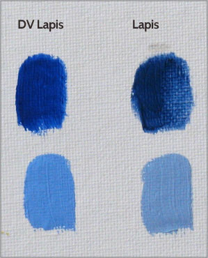
Genuine Lapis Lazuli: natural ultramarine blue, transparent, weak tinter. This paint seemed not bad at all – until I compared it to another brand of natural lapis, Da Vinci:

Daniel Smith Primatek - Lapis

Daniel Smith Primatek – Lapis

Here you can see that the lapis from Da Vinci is significantly more saturated, both neat and in tints. Now it is possible, of course, that the Da Vinci has been enhanced with a bit of modern, synthetic ultramarine to increase saturation; I haven’t had a chance to ask them about it yet. But, assuming that is NOT the case, then that means Daniel Smith is offering a lower grade of natural ultramarine at, as it turns out, about double the price (comparing Daniel Smiths’s website against Da Vinci prices on Dick Blick). Not a great value if so. I will contact Da Vinci at some point and post their response here.

Natural Sleeping Beauty Turquoise Genuine: cyan, opaque, surprisingly strong tinter. I suppose the nearest modern color would be cerulean blue, but the Turquoise is lighter in value. I found this color to be most useful as itself – painted directly onto the canvas without much modification, or as a cool modifier for other light-valued colors to achieve pastel blues, greens, or even violets. It’s not much in the way of a general mixing color, but great as a cyan accent color.

Amazonite Genuine: green-cyan, transparent, medium tinter. This is another of the good ones. (Don’t be fooled by the photograph above – the paint out of the tube is much more saturated than that swatch looks.) Right out of the tube it looks very near to viridian. This works very well as a general mixing green, or as a glazer. An amazing (pun!) paint, really, especially for a natural pigment. On some research, I discovered that despite the name, amazonite is mined right here in the United States, making it almost regional to me. Cool.

Malachite Genuine: pale middle green, opaque, weak tinter, fast dryer. This must be a pretty fine grind of malachite, because it’s high-valued and not very saturated. At the last minute I decided to compare it to my own synthetic copper carbonate green pigment in oil (this is why the swatch on the right is almost hanging off the edge of the canvas). As you can see, the synthetic one is a bit more saturated, both neat and in tints, as well as being slightly bluer (the difference is more marked in person).

Daniel Smith - Malachite

Daniel Smith – Malachite

I think part of the point of using natural malachite is that with the larger particle sizes you can get when grinding a color from stone, you can get a more saturated color than with the smaller particles of the precipitated synthetic malachite. On the other hand, I shouldn’t forget that some of us feel a real pleasure in using a natural pigment, similar to the thrill I get when using a natural earth over a synthetic iron oxide. I also get a thrill from making and using my own copper carbonate pigment, of course, so this one is a toss-up for me.

To be continued!

The Oldest Art Studio

October 17, 2011
Ochre pic - from Gizmodo

Ochre pic - from Gizmodo

Here’s some news that blew me away: The oldest art studio ever discovered (National Geographic). In Africa, a cave was unearthed that included all the basics required for making pigments: natural colorants, tools for grinding them (stones), and bowls for holding the pigments (abalone shells) – as well as some evidence of some fairly complex chemistry in their making, and even color mixing. Which is all extremely cool. But here’s the really cool thing: These art materials are 100,000 years old. Yep, a tenth of a million years is how long (at least) we humans have been making art materials – which means, of course, that we’ve been making art for at least that long as well. I’ve always had a younger date in mind, and have often shared that with my students: say, 30,000 to 40,000 years. But clearly, it’s been much longer than that.

I’m excited by the news of this discovery for a few reasons. One, this means that we homo sapiens have probably been making art ever since we’ve been homo sapiens. One related article at CNN mentioned that fragments of pigment have been found from even longer ago than those in this find, though without the related tools found there. Longer than a hundred thousand years is how long we’ve been painting. In a very real way, I think, making art is a part of what it means to be human – as much as tracking, or storytelling, funeral rites, or any other part of our deepest shared culture.

Second has to do with the pigments themselves. The pigments discovered were ochres and other minerals, charcoal, and bone. None of these is unexpected – but what has an impact on me is the feeling that when I paint with a natural earth pigment, I am a part of a hundred-thousand-year-old tradition. That makes me feel differently about what I’m doing when I use these pigments, in a wide but not-quite-definable way. It makes me feel – human. Really a part of our culture, not our modern veneer and glitz, but the real deal. It feels good.

Third, of course, is the fact that I’m a handcrafter of pigments myself. When I read the article, I immediately felt a strong connection, a kinship even, between myself and those color-makers from long ago. I felt part of a string. I thought about myself, and about some artist grinding earth pigments 100,000 years from now, and about those ancient color-makers from so long ago. I wished they could have known about me somehow, grinding earth pigments so long after they did. And I wondered if they felt the same excitement in the gathering and making of the colors, the same satisfaction with the finished pigments, and the same joy in using them for their art.

I bet they did.

Candle Black

September 12, 2011
Candle Black Ink Drawing

Candle Black Ink Drawing

There was a power outage last week here in the American Southwest. You might have seen it in the news – or even been affected yourself – it was quite a large blackout, about 5 million people without power. It was interesting to go for the evening walk with the dog, seeing house after house darkened, and the unusual sight of neighbors actually talking with each other on the street. Amazing, the things that happen when the TV and computer are out. As always, it brought home to me how lucky we are to have such things as electricity at our constant disposal. With a changing world on my mind, it was a thoughtful but enjoyable walk.

When we got back home from our walk, we lit the place up with candles. Romantic and comfortable as it always is to do so, I found myself by habit still reaching for light switches in every room I entered, even though I was carrying a candle with me. The whole thing brought to mind an experiment I’d carried out some time before to make a different kind of carbon black pigment. The kind of carbon black pigment with which many will be familiar is vine black – created by calcining grapevines in the absence of oxygen – but there’s another kind described in various treatises from the Middle Ages that is made from candles. This is a black pigment with extremely fine particles, which mixes very easily into linseed oil, and makes a beautiful black ink. It’s also a snap to make. Here’s how you do it:

Making Candle Black

Making Candle Black

First, the equipment. You’ll need, not surprisingly, a candle. But not just any candle: this needs to be a natural beeswax candle, not the paraffin or carnauba wax variety. Preferably, it will be a beeswax candle with no perfumes or dyes. You’ll need some kind of metal bowl capable of holding water, and some way to hang it suspended above the candle while the candle is lit. It doesn’t have to be fancy; you can see the system I’ve jury-rigged here. In fact you can tell a lot about me and the kind of stuff laying around my household from taking a look at the different objects I’ve used here: two fantastic books from the DeYoung Museum in San Francisco about impressionism and post-impressionism; an old paintbrush holding up the bowl; a sketchbook to adjust the height of the candle (notice how the cover is bound upside down–I saw it that way on the shelf and of course had to grab it); and the table underneath protected by a newspaper clipping about the power outage, which I just had to put under the candle.

Making Candle Black

Making Candle Black

Fill the bowl with cold water, suspend it, then light the candle and put it under the bowl. The candle flame will deposit its black soot on the underside of the bowl. This is your pigment. You can see in the pic how close the candle should be to the bowl. This will heat the bowl up quite a bit, more than one might think, and that’s why it’s necessary to fill the bowl up with cold water before beginning.

Making Candle Black

Making Candle Black

One of the great things about making candle black is that it’s not labor-intensive at all. You can walk away and do something else while you’re making your pigment. Just wander back once in a while and put a finger into the water to make sure it’s not getting too hot. Once it starts to feel a bit on the warm side, blow out the candle, pour the water from the bowl into a garden plant, and simply scrape your black pigment from the bottom of the bowl. You can keep doing this as long as you wish, of course; you can also periodically move the lit candle around to deposit pigment over a larger area.

Candle Black in Oil

Candle Black in Oil

In this image you can see what this candle black pigment looks like in oil. I made a little set of swatches using homemade candle black and lead white from Rublev. Straight candle black in oil is a really rich, inky black, slightly darker even than my bone black from Rublev. Mixed with lead white, it makes fairly neutral grays. If you’re working in oils with candle black, keep in mind the very small particle size of this pigment, likely much smaller even than lake pigment particles. This means that it might lead to premature cracking of your darks if used too thickly on its own.

Candle Black in Oil

Candle Black in Oil

But where this pigment really shines is as an ink or watercolor. With oil, the candle black pigment dispersed very easily with no mulling at all, just a little mixing together with the palette knife right on the palette. In water and gum Arabic, however, the pigment resisted dispersion mightily. I had to resort to mixing in a couple of drops of glycerin, which helped. Nevertheless, once finally dispersed, it made a beautiful ink. In the large image at the top of the post, you can see the drawing I made with this ink. I’ve been trying to figure out a way, in my ink drawings, to mix quill work with brushwork. This represents another attempt to do so. I don’t think I’m there yet; but this one is better than some of the ones I’ve done recently, and I’m happy that my more successful attempt happened with the homemade ink.

Candle black is a beautiful color, historic, sustainable, and easy to make. Grab a beeswax candle and give it a try!

Da Vinci “Natural Pigment” line of oil paints

August 7, 2011
Da Vinci Natural Pigment oil paints

Da Vinci Natural Pigment oil paints

I thought I’d show some of the Da Vinci “Natural Pigment” line of oil paints, since I’ve got several of them, and they came up in Mariposa’s “Snob Paints” thread (in the Oil Painting forum at WetCanvas). As I mentioned there, I think Da Vinci paints are underrated paints in general. They are all nicely long and brush out well, and are willing to separate in the tube after a while (in my opinion, this indicates an appropriately small amount of stabilizer in the paint). Da Vinci are my favorite non-premium oil paints, though I admit a few of their pigment choices and color names are questionable to me. But I think their line of Natural Pigment paints is really noteworthy. To the right is a pic of the ones I’ve got on the palette.

Each is shown from the tube, then mixed with an approximately equal amount of Winsor & Newton zinc white.

In the group of four on the top right are (from right to left): Natural Gold Ochre; Brown Ochre Geothite; Arizona Red; and Hematite Violet.

Da Vinci Natural Pigment

Da Vinci Natural Pigment

These are the four that are most impressive right out of the gate. The Natural Gold Ochre is one of the two most intense yellow ochres I’ve used (the other being Rublev’s Lemon Ochre). I’m fairly certain it is a Blue Ridge blend of yellow ochres. The Brown Ochre Geothite should really be called Orange Ochre in my opinion, it’s great for warm darks in skin tones, or for glowing highlights in hair – it’s like a warmer version of raw sienna. The Arizona Red is my best dark scarlet earth, and I love that the pigment is regional here. And the Hematite Violet – well, just look at it. It’s a glorious, intense dark red that steers hard toward magenta in tints. Love it – love it!

Next group of two, again right to left: Arizona Brown Ochre; and Red Iron Stone.

Da Vinci Natural Pigment

Da Vinci Natural Pigment

These are two that I was relatively unimpressed with at first, but which have proven themselves extremely useful. The Arizona Brown Ochre has been very good for underpaintings, as well as being a helpful starting point for mixing various nondescript midtones that can be tricky to get to precisely. It dries very quickly (must be an umber of some sort, though it’s opaque), which keeps it off my palette much of the time unless I have a specific use for it; and it has low tinting strength. The Red Iron Stone turns out to be a nearly perfect starting point for flesh halftones, and in contrast to the previous paint has a pretty high tinting strength (the tint here actually contains somewhat more white than red).

The last group of three: Olive Oxide; Lapis Lazuli Genuine; and Magnetite Genuine.

Da Vinci Natural Pigment

Da Vinci Natural Pigment

These last three are paints that I find pretty and interesting, but which I just haven’t had much use for yet. I plan to try the Olive Oxide for underpaintings. The Lapis makes a great glazing blue, being less intense than ordinary ultramarine; I just haven’t happened to need a glazing blue in any of my recent paintings. The color of the tint in this pic has been somewhat blasted out by the light source; nevertheless it is not strong in tints. The Magnetite is somewhat like a Mars black (in fact it is a natural iron oxide), but with a very low tinting strength, practically disappearing in some mixes. I’m sure this will make it useful for things like neutralizing skin tones, once I get more used to using it.

At a price range of $11 to $20 for earth colors, these might be considered slightly “snobby” paints. To me they’re worth having, and I recommend trying some of them – I have found it interesting and fun (and easier!) to paint flesh with many different earth colors, rather than just a couple of cadmiums. The most expensive among those I have are the Lapis (unsurprisingly), the Gold Ochre, and the Red Iron Stone. There are a few of the line I still need to try.

The “must-have” of the bunch: Hematite Violet. Definitely.

Da Vinci Hematite Violet

Da Vinci Hematite Violet

Crossposted to a couple of forums at WetCanvas.

Sap green

July 10, 2011

I’ve been neglecting the blog, because I’ve been insanely busy with getting my portfolio together, building my site, etc. But I’ve been experimenting with this and that as I’ve had time. Some of my recent adventures: an anthocyanin blue from geranium blossoms; an iron weld lake; shopping for a dragon’s blood tree; studying carmine in the wild; the first really successful madder lake from my garden plants (and figuring out how to make a dark and a light madder lake from the same batch); and the finding and purchasing of a natural-lake oil paint, from a very mainstream company, that has been out of circulation for most of a decade. I’ll share all that stuff with you, but for today I’ve prepared an article about sap green:

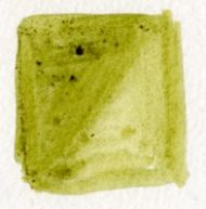
Sap green is a traditional color that enjoyed popularity from medieval illumination all the way through the Romantic era of watercolor painting. It is a warm, yellowish green, transparent, tending toward olive in masstone and a brighter, livelier green in tints. As an artist’s color it has been quite useful to many artists, filling in a difficult mixing area of the color wheel, supplying beautiful and interesting transparent green shadows, and lovely mixtures for foliage. It is fugitive, of course, like most natural organic colors, which is why it fell from vogue in the nineteenth and twentieth centuries, when modern synthetic greens that were more lightfast became widely available.

The color sap green is derived from the berries of the buckthorn plant. The usual plant used was rhamnus cathartica, or common buckthorn, which is found in the British Isles. The cathartica part of the species name refers to the fact that the buckthorn berries can be used as an emetic, and the plant is often mentioned in older medicinal treatises.

Sap Green - © MFA Boston

Sap Green - © MFA Boston

The dyestuff in Northern Europe is common and economical, and yields a beautiful color – small wonder it was popular for so long. The plant has been naturalized in parts of North America, and has become quite a problem in those areas, because common buckthorn can be very invasive. It spreads rapidly and aggressively, has no natural enemies on this continent, and quickly takes over an area of woodland, squeezing out the natural flora, and in the process some of the natural fauna as well, as they lose their traditional food sources to the invader. My original excitement to try growing this plant was dampened considerably upon learning of the problems associated with it.

I’m quite a fanatic about natural colors, of course; so, while I am an adamantly against risking introducing an invasive species into the ecolocality in which I live, I nevertheless spent some time in negotiations with myself. The common buckthorn is invasive in much cooler and wetter areas than southern Californa; there is little way the plant could be as successful here. In any case, the plant reproduces sexually and needs both a male and a female plant to spread; I’ll just get one plant, I reasoned, and so I’ll be safe. But in the end, I decided sadly that it just wasn’t worth the risks. I want to grow plants that can have a future in my garden and others – common buckthorn clearly doesn’t fit the mold, at least not on this continent. (The closest thing I have to an invasive species is madder, which is spreads agressively through root runners. But madder I feel confident I can control by killing it off if necessary, mainly because the birds and other animals of the area are not interested in its berries or seeds, so the chances of it spreading without my knowledge are greatly reduced. Common buckthorn does not have that element of safety; its berries are enjoyed and spread by many varieties of bird.)

If you happen to live in an area that has been invaded by common buckthorn, you have every opportunity to make some real sap green; for goodness sake go out and pick some berries. Every berry you use is one that cannot spread the species further.

There is another, non-invasive species of buckthorn that is actually much better suited for the hot and dry weather of California, being from the Mediterranean area of the Old World: rhamnus infectoria (or rhamnus saxatilis), the same buckthorn that is used to make stil de grain yellow lake. While a green can be made from the berries of this plant (depending on how ripe they are), it is much better used as a source of the lovely yellow stil-de-grain. You can get the berries from dye shops. I’ve been thinking of getting some seeds and growing a shrub in my garden plot; unfortunately, they seem a bit difficult to come by.

This is one of several posts I’ll make concerning the importance of localism in thinking about the sustainability of artist’s colors. If I lived in Northern Europe, sap green would be a primary color on my watercolor palette. Here in the American Southwest, it can’t be.

What is a sustainable color?

January 30, 2011

Or: the good, the bad, and the ugly

Despite more than a bit of misuse in popular culture, what the word “sustainable” actually means is simple – though the implications are quite profound for us all – and it’s this (from merriam-webster.com):

  1. : capable of being sustained
  2. a : of, relating to, or being a method of harvesting or using a resource so that the resource is not depleted or permanently damaged
    b : of or relating to a lifestyle involving the use of sustainable methods

So here’s my interpretation for the purposes of this discussion (and my own philosophy):

An activity is sustainable if it in no way impedes the ability of future generations to live their lives or to engage in the same activity or other activities – for all intents and purposes forever.

If an activity does not meet that test, then it is unsustainable. Can’t keep it up forever. Can’t sustain the activity indefinitely. If you try to keep up that activity forever, then eventually you crash. It’s a fail.

Sustainability is not a nicety. It’s a requirement and a hard fact. If an activity is unsustainable, then that means we will stop doing it – eventually. The only question is whether we cease the activity voluntarily, or are forced out of it through diminishing options – or whether we ourselves will meet our end before it becomes an issue. (As one cynic put it: We will keep doing what we do until we can’t any more, and then we won’t.)

So that’s my strict definition. But “forever” is a little hard for the human brain (at least my human brain) to comprehend and plan for. When I think about this stuff, I tend to think in more discrete chunks of time, because it’s easier for me, and it clarifies my thinking: five thousand years from now, ten thousand. Will our heavy industry still be consuming at its present rate in ten thousand years? Will the Three Gorges Dam still be standing? Will we still be mining for cobalt?

This, of course, is a blog about art materials, and more than anything else it’s about colors. So which colors are sustainable? Which are not? Which are finite, but nevertheless are abundant enough to probably last the long millenia?

The good

These are the materials that really could last pretty much until the end of the world. Non-destructive, renewable, natural organic colors (definition here) that can be raised or wildcrafted in one’s own bioregion (geographic backyard), and can replenish themselves, through careful horticulture or natural propagation, and can be prepared over a simple fire using abundant, locally available ingredients – these are probably the only colors that can be considered truly sustainable by our strict definition above. One can conceivably at least keep up that activity pretty much forever, so it does pass that test, assuming it’s done with care. (However, it should definitely be noted here that not all natural organic sources pass the test. More on that in the next post.)

Also, I think we can go a little easy on ourselves here and throw the natural earths into this category. Although technically they are finite (especially the nice brightly-colored ones), well, there’s just a heck of a lot of the stuff out there. It’s a little hard to imagine artists ever managing to use up all the red earth in Arizona – or Brazil.

The bad

The pigments that are most clearly unsustainable, for various reasons that should be fairly obvious, are the ones that are manufactured from petroleum or other hydrocarbons. These synthetic organics (definition here) are going to go away sooner or later – more likely sooner. For me this is the most easily identifiable group. Flatly not sustainable, because petroleum isn’t. End of story. I’ll actually be rather surprised if they manage to still be around for much longer than another decade or two.

Perhaps slightly less obvious are the pigments that merely require a hydrocarbon-driven industrial process for their manufacture. They may not have petroleum as their basic feedstock, but they are just as dependent upon it for their existence. I don’t see how this group can make it out of the cellar either. I’ll be going through a few examples in later articles.

The ugly

Any material which is finite is therefore, strictly speaking, unsustainable. However, common sense and a little research indicate that there are certain natural inorganic materials that are so plentiful (and in some cases highly recyclable as well) that we probably don’t really need to worry about them, at least not for a very, very long time. Iron and alum in particular, which can be used to make Mars pigments and lake pigments, will almost certainly not deplete completely from the major regions of the earth in any time scale meaningful to this discussion. Also, the minerals calcium, sodium, potassium and sulfur – also used in the creation of lake pigments and some other pigments – are in abundant supply as well. There are a few other materials that I also count as reasonable candidates for this group, depending on other factors.

So, luckily, I doubt we will ever be restricted to using natural inks and earths only, even though they’re the only materials that actually made it into our “good” category. (As much as I love natural inks, I do like to make an oil painting once in a while.) We’ll be collecting earths, and making lake pigments and a few synthetic inorganic pigments (definition here), for a long, long time to come.

Forever? Can’t answer that. Ten thousand years from now? Almost certainly.

Details to follow…