This is a review of Daniel Smith’s Primatek line of oil paints, which I’ll post in two parts. These are a set of natural-pigment paints, some of them quite unconventional. They have this line of oil paints, and also (and perhaps more popularly) watercolors. I haven’t tried any of the watercolors yet; I probably will someday, some of them look amazing (the garnet!).
First, an overview. The colors I tried in oil are:
Sedona Genuine, a red ochre from Arizona;
Minnesota Pipestone (Catlinite), pink pipestone;
Rhodonite Genuine, a rose-colored gemstone;
Purpurite Genuine, a violet mineral;
Genuine Lapis Lazuli, natural ultramarine blue;
Natural Sleeping Beauty Turquoise Genuine;
Amazonite Genuine, a lovely green stone;
Malachite Genuine, natural copper carbonate green.
Here are the swatches. Each color is painted from the tube (some with a bit of poppy oil added) and approximately 50/50 with zinc white (Winsor & Newton). You can see which ones are the strong tinters. There are also three other paints included for comparison.

Daniel Smith Primatek
The fastest driers were the Malachite (no surprise, as it’s a copper pigment) and Rhodonite, both touch-dry after three days. The Amazonite, Lapis, Sedona and Purpurite were dry after five days, and the Turquoise after seven days. The Sedona, strangely, was the slowest dryer in the bunch, still slightly tacky after a week.
Some of these paints were very impressive, others not so much. I’ll go through them individually here.
Sedona Genuine: red ochre, opaque, medium tinter. This is a pretty standard red ochre – perfectly serviceable and pleasant to use, but nothing out of the ordinary. What makes this paint fun for me is the same thing that makes Da Vinci’s Arizona Red and Arizona Brown Ochre interesting for me: it’s local to my region. I’ll probably keep using it for that reason alone.
Minnesota Pipestone: red ochre with rose tints, semitransparent, weak tinter. I have to say, this one was disappointing. I’ve used a Pink Pipestone pigment from Rublev, ground into oil and tubed by myself, that is a delight – delicate pinks for skin tones or satin highlights on white fabric. I was expecting something similar here, but it was darker and significantly less saturated (and not NEARLY the color as shown on the Daniel Smith website!), both on its own and in tints. Here is a comparison of the Daniel Smith against my own:

Daniel Smith – Pipestone
Usable, I suppose, but not the exciting paint that it should be.
Rhodonite Genuine: rich rose color, transparent, strong tinter, fast dryer. This paint is one of the good ones. An amazing rose color that seems as if it must be an organic, it’s so saturated – and yet it’s ground from a stone. I immediately wanted to see if this could be used as an alternative to rose madder. It can’t, not quite – it’s a bit more magenta, and though it’s transparent, it’s definitely less transparent than madder, and therefore not as easy to glaze. But, as I’ll show, it can be used for rich skin tones.
Purpurite Genuine: dark violet, transparent, medium tinter. As many are aware, violet is a color that has long been problematic for artists, as historically there just don’t seem to be all that many usable pigments in this hue range. This one is an interesting attempt to provide another. As it turns out, purpurite is very nice for dark purples, but it loses quite a bit of saturation in tints. I was actually able to get better purple tints by mixing the Rhodonite with the Lapis.
Genuine Lapis Lazuli: natural ultramarine blue, transparent, weak tinter. This paint seemed not bad at all – until I compared it to another brand of natural lapis, Da Vinci:
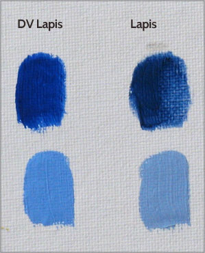
Daniel Smith Primatek – Lapis
Here you can see that the lapis from Da Vinci is significantly more saturated, both neat and in tints. Now it is possible, of course, that the Da Vinci has been enhanced with a bit of modern, synthetic ultramarine to increase saturation; I haven’t had a chance to ask them about it yet. But, assuming that is NOT the case, then that means Daniel Smith is offering a lower grade of natural ultramarine at, as it turns out, about double the price (comparing Daniel Smiths’s website against Da Vinci prices on Dick Blick). Not a great value if so. I will contact Da Vinci at some point and post their response here.
Natural Sleeping Beauty Turquoise Genuine: cyan, opaque, surprisingly strong tinter. I suppose the nearest modern color would be cerulean blue, but the Turquoise is lighter in value. I found this color to be most useful as itself – painted directly onto the canvas without much modification, or as a cool modifier for other light-valued colors to achieve pastel blues, greens, or even violets. It’s not much in the way of a general mixing color, but great as a cyan accent color.
Amazonite Genuine: green-cyan, transparent, medium tinter. This is another of the good ones. (Don’t be fooled by the photograph above – the paint out of the tube is much more saturated than that swatch looks.) Right out of the tube it looks very near to viridian. This works very well as a general mixing green, or as a glazer. An amazing (pun!) paint, really, especially for a natural pigment. On some research, I discovered that despite the name, amazonite is mined right here in the United States, making it almost regional to me. Cool.
Malachite Genuine: pale middle green, opaque, weak tinter, fast dryer. This must be a pretty fine grind of malachite, because it’s high-valued and not very saturated. At the last minute I decided to compare it to my own synthetic copper carbonate green pigment in oil (this is why the swatch on the right is almost hanging off the edge of the canvas). As you can see, the synthetic one is a bit more saturated, both neat and in tints, as well as being slightly bluer (the difference is more marked in person).

Daniel Smith – Malachite
I think part of the point of using natural malachite is that with the larger particle sizes you can get when grinding a color from stone, you can get a more saturated color than with the smaller particles of the precipitated synthetic malachite. On the other hand, I shouldn’t forget that some of us feel a real pleasure in using a natural pigment, similar to the thrill I get when using a natural earth over a synthetic iron oxide. I also get a thrill from making and using my own copper carbonate pigment, of course, so this one is a toss-up for me.
To be continued!
Tags: art materials, Daniel Smith, Daniel Smith Primatek, natural pigments, oil paints, Primatek

May 5, 2014 at 3:26 pm |
That turquoise is interesting. I have an old tube of it from about 12-13 years ago but mine is much grayer than that. Maybe they changed their source or processing over the years? Since it’s natural I’d expect some variation between batches.
May 5, 2014 at 6:39 pm |
Thanks cavepainter – on comparison, I see the photo did saturate the turquoise somewhat from reality. It’s so dang hard to calibrate these digital photos! I’ll see if I can correct it and if so, I’ll post an updated photo.
May 31, 2014 at 10:02 pm |
[…] Adventures in the quest for color. « Daniel Smith Primatek Oil Paints Review – Part 1 […]
June 25, 2014 at 4:21 pm |
[…] and whites, plus rose madder and that great turquoise paint from Daniel Smith that I reviewed here and here in my art materials […]